ARCHETYPE CROSSFIT
I was commissioned to create the brand identity for Archetype CrossFit, a CrossFit gym whose mission is to make fitness accessible to all. Archetype CrossFit offers an approachable, community driven and empowering space for individuals to meet and exceed their fitness goals. After two rounds of logo concept reviews the final logo and secondary word mark were chosen and the gym storefront was ready for opening. Archetype CrossFit has seen great success since it’s grand opening and is now a staple fitness destination in the heart of Chicago, competing and taking in new athletes every year. I loved every aspect of working to bring the clients dream company to life through design and I see this project as a standout favorite of mine.


Round One
IDEATION
Starting out I ideated on symbols, visual weights and typographic styles that best evoked the brand’s mission of inclusivity and strength. As a fitness brand built on lifting each other up I knew that I wanted the logo to feel strong and supportive. I then presented these logo drafts to the client and we worked to together to define what felt the most on brand.


Round Two
REFINEMENT
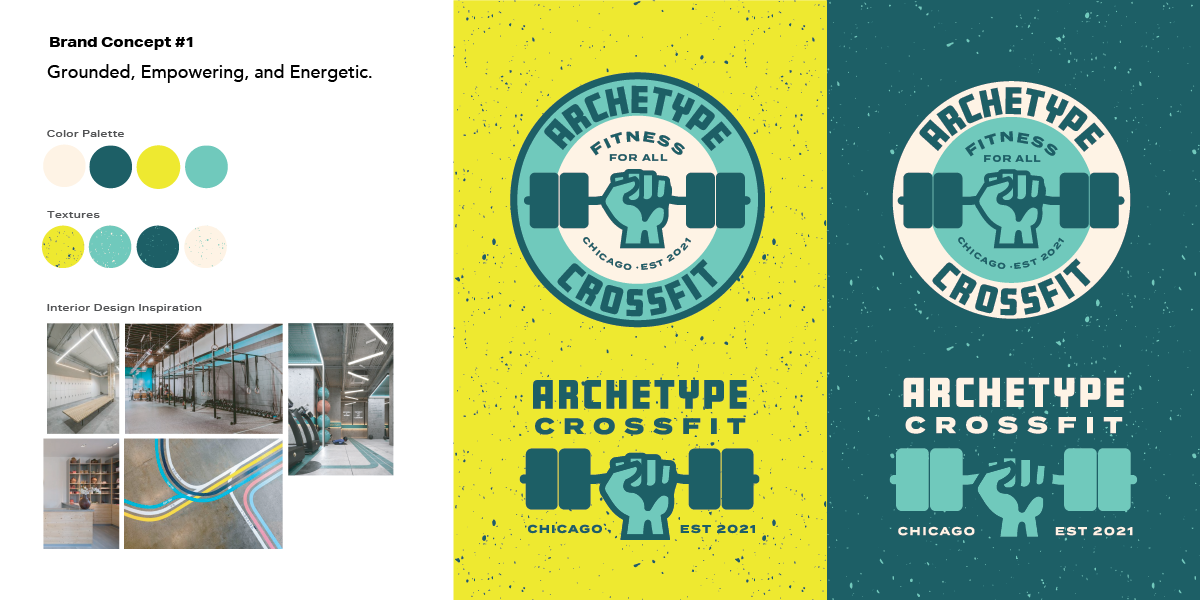
I further refined my brand concepts using color and texture to bring the logos to life. At this tage I began collaborating with the Interior Designer’s inspirations for the interior gym space. I crafted color palettes that feel energizing and welcoming to further reflect the brand’s personality.
ADDITIONAL ASSETS
Two years after the initial branding and gym was established, I created a series of enamel pins to be rewarded on a merit basis to attendees that have met their fitness goals. I designed unique emblems for 1 year, 2 year, 3 year and 100 classes achievements.


